Fall 2023 | ADES 4520
Advertising CampaignProfessor: Douglas May
The Challange
No Visual Identity
As an upper-mid-scale hotel chain with more than 2,900 locations globally, Hampton Inn claims to provide thoughtful services and seamless experiences designed with function and comfort. However, their current branding lowers the quality as the logo and color palettes of red and blue don't match their contemporary and inviting interior design. The brand lacks an impression and differentiation from other upper-mid-scale and mid-scale hotel chains.
The Opportunity
Redesign recognizable brand identity
Create a logomark, a logotype, and patterns, and extend the brand's products and services to increase brand perception, loyalty, and familiarity. Choose a color palette to reflect the brand's friendly service, function, and comfort slogan. Unify the brand's representation.
The Outcome
Differentiate our brand
Category Advertising CamRevitalizing the essence of hospitality with a rebranding and advertising campaign for Hampton Inn. Embrace the allure of functional elegance, revel in comforting spaces, and be drawn into an inviting embrace. My design journey transforms each detail into a warm invitation, ensuring every stay feels like a familiar yet rejuvenating retreat.
Brand Identity
Logo
Type & mark
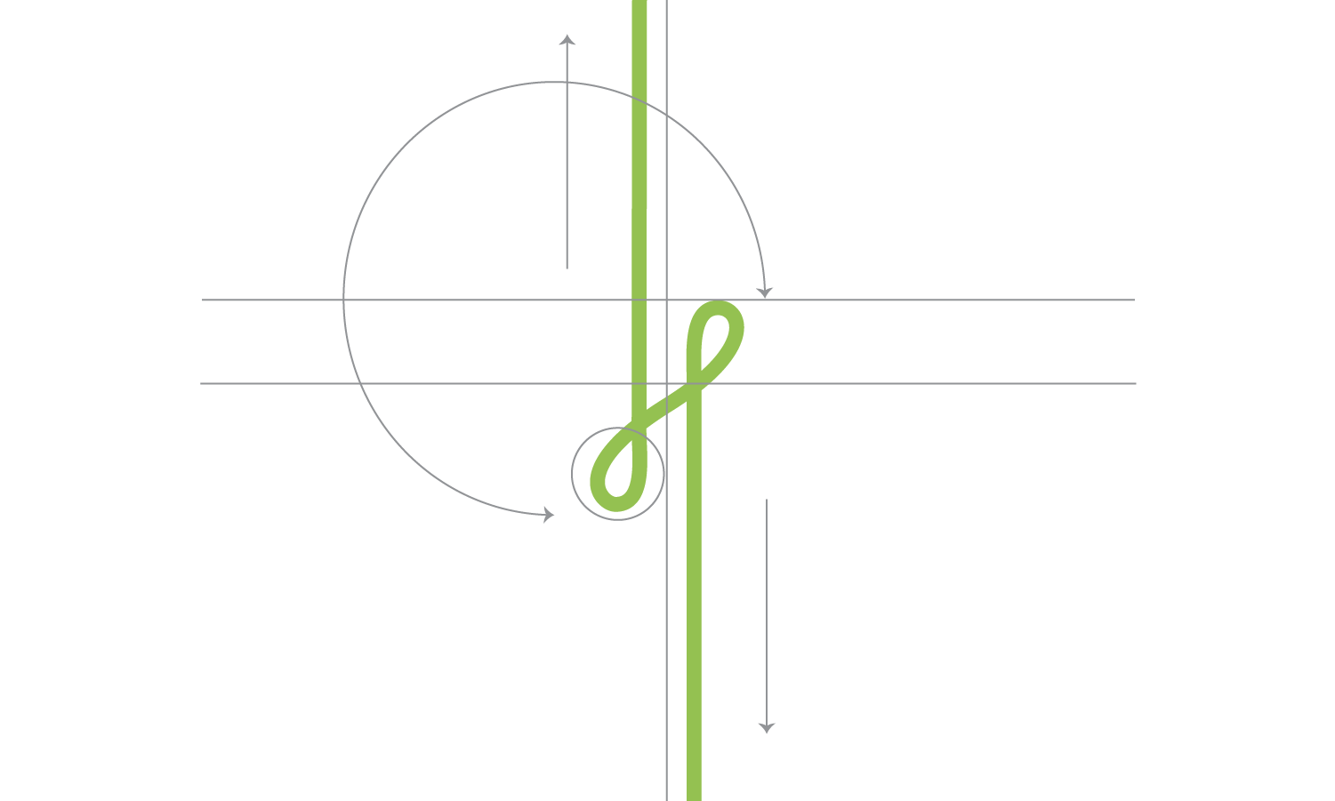
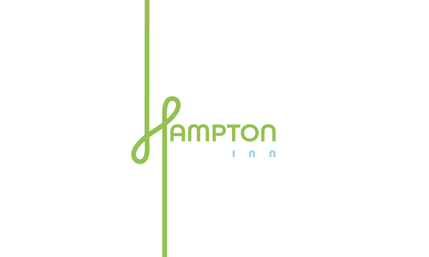
Drawing ideas from human connections in the hospitality industry, loops on initial H strengthen that value. As an indication of the organic nature of human interaction, the loops are asymmetrical and not precisely circular. Stacking letterforms increases reliability. The sans-serif typeface with rounded corners conveys the brand's contemporary aesthetic.


Color Palette:
Inviting and fresh
While exploring photo galleries from different Hampton Inn locations, there is a repetition of a green, yellow, orange, and light blue color palette in their contemporary interior spaces. Adding purple for relaxation and comfort and white to balance the energy of multiple color choices. Therefore, a variety of colors enhances flexibility and allows opportunities for extending a brand's visual identity.
Patterns
Interactive & engaging
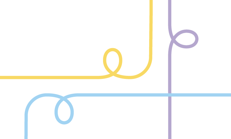
They exhibit adaptability, alternating between straight and curved lines, both horizontally and vertically. The continuity lines across the surface signify growth and heightened motion. Variety in placement welcomes diversity of human backgrounds. The ability to shift the shape of the looping symbol represents the flexibility required to provide considerate and cordial service.


Texture
Wood
To bring back the warm invitation to the hotel, wooden textures are added to the brand's visual identity. Adding a sense of nature increases the freshness. The wooden texture blends seamlessly between the spaces of function and comfort.
The Impact
Value human connection
My design aims to provide a cozy and relaxed stay for small groups of family and friends and a larger group. Hampton Inn will be the initial potential consideration and ultimate decision for business and school leadership retreats. This is accomplished to maintain a position of stability within the hospitality industry, which is experiencing rapid growth due to the rise of Airbnb. In a setting that fosters human interaction and involvement, the human connection is strengthened, resulting in stronger relationships between individuals.
